Healthful
An AI design thinking copilot for healthcare
Challenge
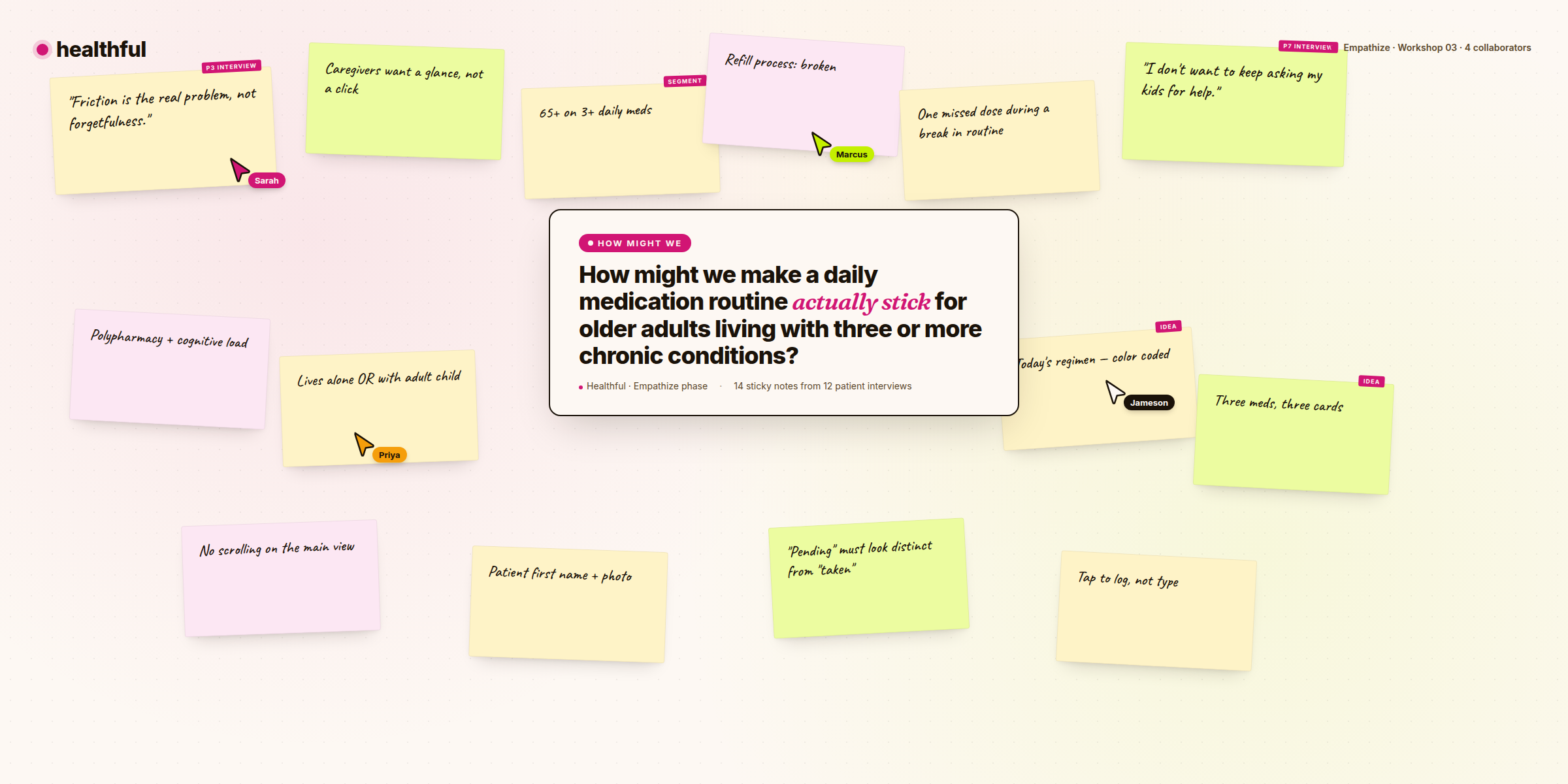
Healthcare still runs on fax machines. The kind that need toner. In 2024, a surgical office can complete a procedure, document the care plan, then transmit that plan to the receiving primary care doctor over a 1980s technology that nobody else in the economy uses.
The rest of us got a generation of beautifully-designed software. Healthcare got the things nobody else can be bothered with. The gap between what healthcare could feel like and what it feels like today is, by a wide margin, the most interesting design problem I have worked on in ten years.
I built Healthful to find out what it would take to close that gap, and whether AI could help a small team do it on the timelines health-tech has to work with.
Product Strategy
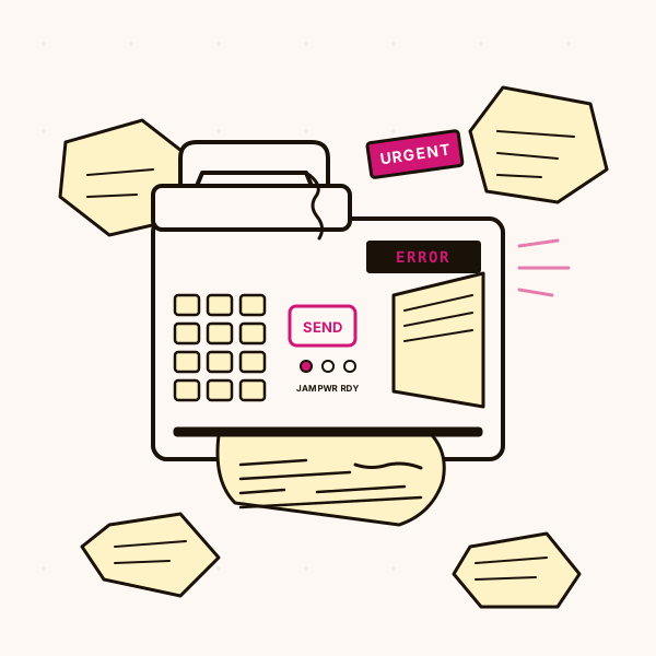
I framed Healthful as one AI surface for the entire design thinking workflow, with five phases that map straight onto the way I had been doing this work for a decade. Define. Empathize. Ideate. Prototype. Launch. The job inside each phase has not changed. What changed is how much of the busywork inside each phase a small team has to do by hand.
The bet is that the biggest value of AI to a designer is the busywork compression. Synthesizing 47 user interviews, generating persona variants, drafting a stakeholder pitch deck: these are repetitive, time-consuming, and the parts of any design week that good designers complain about most. They are also the parts LLMs are very good at.
What I did not want Healthful to take over were the judgment calls. Which insight do you pursue. Which patient story matters. Whether the clinician across the table from you is going to trust the thing you just built. The whole product is shaped around that line.
Research (Meet the users)
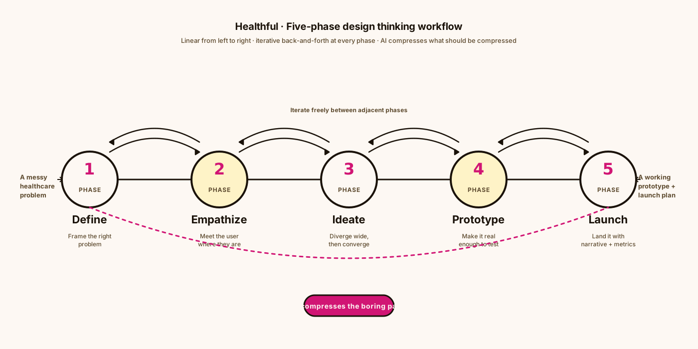
Before writing any code I sat down with 14 designers, PMs, and clinical leads inside health-tech orgs of every size, from 6-person seed startups to 40,000-person hospital networks. The pattern was depressingly consistent. Tools were fragmented. Research budgets had been the first thing cut in 2024. Shipping anything that touched a patient still took six months of stakeholder choreography for reasons nobody could clearly articulate.
The four personas that came out of those conversations are the ones you see here. They are not the lone-genius designer the tech press still imagines when it writes about design tools. They are people on small teams inside complicated organizations, trying to make a series of small judgment calls every day with not enough time and not enough information.
Each persona became a target for the prompt library: how can Healthful take the most repetitive thirty minutes out of their Tuesday without flattening the parts of their week that make the job worth doing?




Wireframes & Prototyping
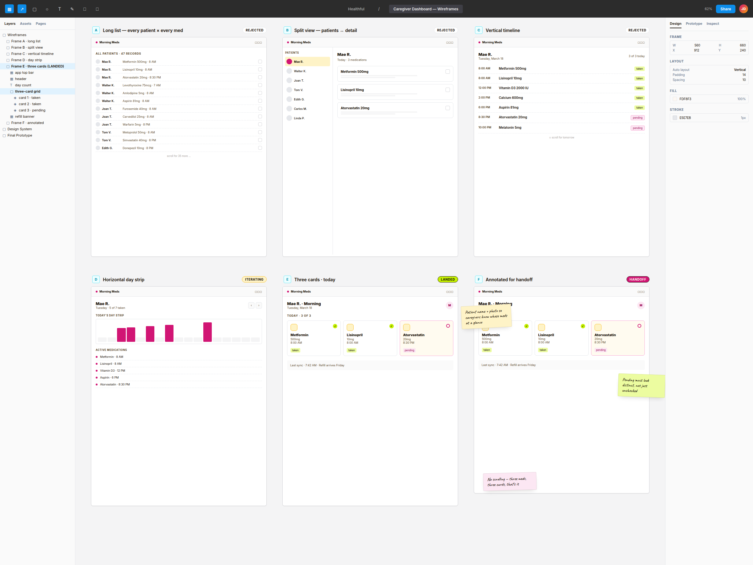
For one of the early prototypes I picked a single screen and iterated it six times. The screen was a caregiver dashboard for one specific patient: an 80-year-old woman named Mae R. who takes three medications a day for three different chronic conditions. I wanted a layout that survived its first encounter with a real caregiver.
The first frames failed in ways that look obvious in hindsight. A long scrolling list of every patient and every medication was unreadable. A split view between patient list and patient detail turned a glance into a click. A vertical timeline of one patient's day forced the caregiver to scroll past meds Mae had already taken before they could see the ones she still needed.
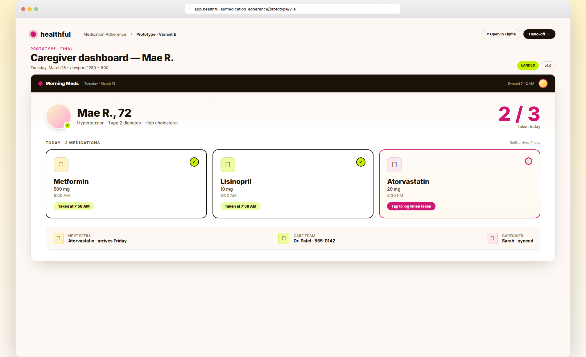
Frame E was the one that landed. Three cards for Mae's three morning meds, color-coded so taken and pending look like different things at five feet, no scrolling at all. Frame F was the same layout with sticky-note annotations for the engineer who would implement it. The shape of Frame E is what now drives the medication-adherence demo on the live Healthful site.
Design System (Living Pulse)
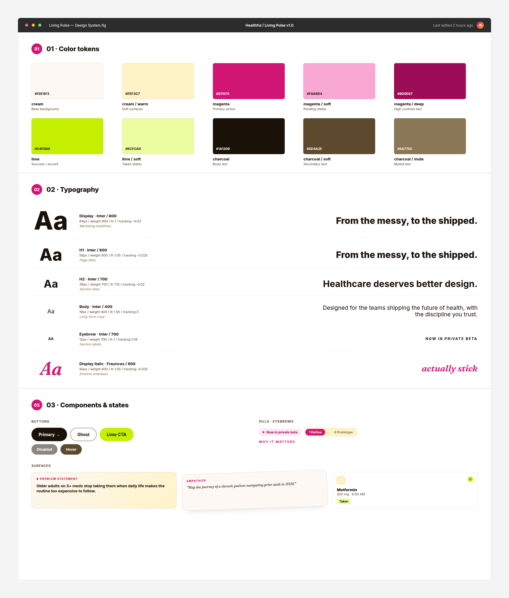
The brand and design system, called Living Pulse, exists because every health-tech product I have ever shipped has started with the same handshake: a sterile palette of blues and greens, Helvetica or Inter, and an icon library that has never been chosen so much as inherited from the last team. It is a fine starting point. It produces fine, indistinguishable work.
Living Pulse is the opposite by design. Cream as the base instead of cold white. A single magenta as the action color, used sparingly. Lime as the success state, because nothing in health-tech has ever celebrated anything in lime. Two type families: Inter for the UI, Fraunces for the moments where the writing is doing the heavy lifting. The components map onto the five design thinking phases so the system grows alongside the framework.
Everything started in Figma. The token names match between the Figma file and the production CSS variables, so the brand and the code never drift apart.
- •Cream base (#fdf8f3) with magenta (#d11574), lime (#c4f000), and charcoal (#1a1209) accents
- •Inter for UI text, Fraunces italic for the moments where the writing is doing the heavy lifting
- •Pulse-heart logo mark, animated gradient blob backgrounds, hand-drawn process diagrams
- •Five phase pills, problem-statement card, prompt cards, persona cards, medication card
- •Tailwind v4 token system, fully responsive, prefers-reduced-motion respected
- •Token names match between the Figma file and the production CSS variables
Final Prototype
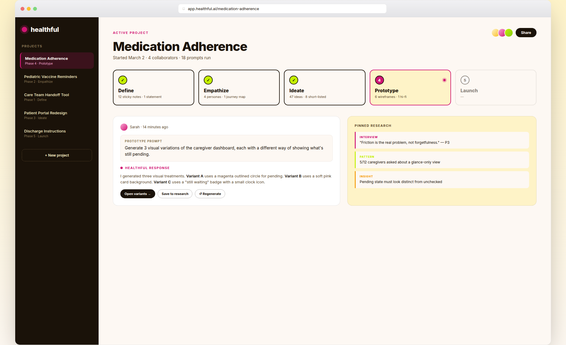
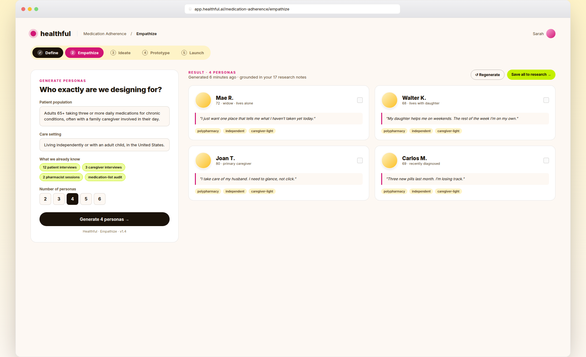
I designed three high-fidelity product screens to show what Healthful would feel like once a team is using it day to day. The first is the project workspace: a sidebar of projects, the active project's five phases laid out across the top, recent activity from teammates underneath. The second shows the Empathize phase mid-flight, with a prompt form on the left and four AI-generated personas on the right that the designer can save into research or regenerate from scratch.
The third screen is the payoff. It is the same Mae R. medication dashboard from Frame E in the wireframes section, except now it is a real product screen. Mae has a name and a face. The med cards have proper type, proper shadows, and a footer strip that carries the things a caregiver needs in the first three seconds of looking at it: what is still pending, when the next refill arrives, the care team's phone number, the name of whoever else has been syncing with the dashboard from somewhere else.
Impact
- •Ran early product-forming workshops with senior design and product leaders from health-tech startups, hospital innovation labs, and pharma R&D teams.
- •Validated the five-phase AI design thinking workflow with real teams shipping into clinical and patient-facing contexts.
- •Iterated the prompt-card system across several rounds of workshop feedback, simplifying the language, tightening the framing prompts, and dropping the ones nobody used.
- •Designed the Living Pulse brand and design system so the marketing site, the prompt cards, and the future product all share the same tokens and components.
- •Released the AI Design Thinking Prompt Cards as a free public PDF, so any team can run a complete sprint with any modern LLM. No login required.
- •Recruited a small group of health product teams into the private beta to shape the v1 product roadmap.